Tips on creating an email template that works with your website
Email marketing is one of the most important digital communication tool with your clients or potential clients. When done right is can be very effective and convert to sales but when done wrong it can have a negative effect.
After investing in a professional website, it is important that your email campaigns are consistent with your main website both in look and in message.
This blog post is about look and feel of the email, not content strategy which I will discuss in the next post.
No matter which email platform you use, the elements are the same, here are some tips on creating an email template that works with your website -
email banner:
Use the same banner image from your website – if you have a moving banner select the first one of the one that represent your brand best.
If you use a tagline, use the same one on your email banner
You can re-size and crop the banner to match the size requirements for your email marketing application.
Logo:
Make sure your logo appears in your email either at the top, part of the banner or at the end. No matter which email platform you use, the elements are the same. assume your readers remember your brand only by name.
fonts:
If possible, use the fame fonts and styles as on your website. Most email applications only allow a few main web fonts so select one that works best with your brand and use it in all your emails.
Language:
Make sure that the way you write to your readers is that same way your copy is written on your website. If it is friendly and first person, keep this in your emails.
Photos:
As an email marketing campaign allows you to use new photos each time, photos that might not be on your website, make sure they are the same style and work well with your brand. for example, if you are using stock photos on your site, find more photos from the same style.
Footer:
use the same colours and style from your website and include links to main pages on your website to make readers visit your website.
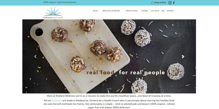
The example below is for Radiant Wellness - a granola producer in Melbourne, the website banner features a set of professional photos, one of them is used for the email banner. I selected this photo and not the one showing product in packaging as the email is all about tips and recipes which this photo is all about.
The logo, fonts and colours also work well with the main website but adapted to email layout. The logo is larger and centred to help with email mobile view.
Radiant Wellness Website Top View
Radiant Wellness email top view
In conclusion, using a few simple steps, your email campaigns can match the look of your website and help with your overall brand message. Tools such as Mail Chimp and Canva can help you achieve this easily.


