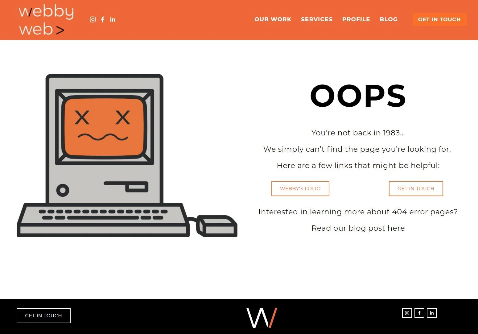
Tips for 404 pages + 404 error page examples
Did you know that your 404 error page can increase your conversions and generate sales?
Crafting a 404 page with the right messaging, design and and call to action can turn lost visitors into customers.
What is a 404 error page?
In technical terms it is the HTTP standard response code indicates that the server could not find what was requested.
The error message is typically: 404 Not Found, 404, Page Not Found, or Server Not Found.
This means that as visitor entered a URL that does not exist in this website.
This happens on every site and most often site owner is not aware of all broken links.
Why does a 404 error occur?
Change in content: pages are deleted, products removed, update to page names (URL)
New website: old website links or pages that do not exist anymore. This happens often when re-developing a website and no redirect is created.
Error in entering the URL – by user
Error in entering URL by link provider (on site or from another site to yours)
Outdated search engine link
Why is a 404 page important?
There is noting like first impression.
When visitors land on a 404 page which is often a technical error page they are most likely to press the back button immediately and will probably not visit your site again.
A targeted and properly designer 404 page can prevent this.
Tips on how to create a good 404 page:
Engagement – well crafted copy that will re-engage your site visitor is very important – they are already not happy as they did not find what they are looking for so it is important to make things right.
Language – a basic 404 page is very technical and most visitors will not understand and only see ‘error’ – tell them in plain Lagrange what happened.
Use phrases people will understand – ‘the page you are looking for can’t be found’ or ‘sorry, something went wrong’
Be careful not to blame the visitor for the error. Apologise.
Show your brand personality – By showing your brand personality you connect better with your customers. This can be reflected by the tone of voice or graphics used on the page.
Call to action - Give visitors something to do instead or clicking the browser back button.
This is where you can convert them back to your site content and convert sales.
A few options:
Search bar – offering them to search for what they were looking for (which will bring them real site results). This is especially important for products.
Link / buttons to popular content – This can be back to home page, products, folio, blog post – your most popular site page.
Link to contact page – sometimes this is all that they are looking for so make it easy to find.
404 error page examples
Browse the gallery below (and it includes links) for some great 404 error page examples that incorporate elements discussed in this article.
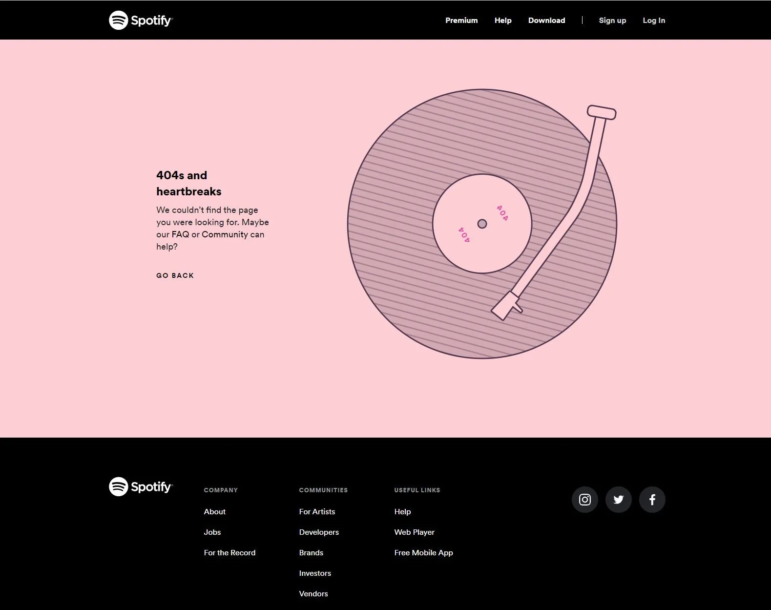
Spotify 404 error page: Clever play on words - a song title by Kanye West (808 and heartbreaks) and an old record - links to FAQ and community to help find information.
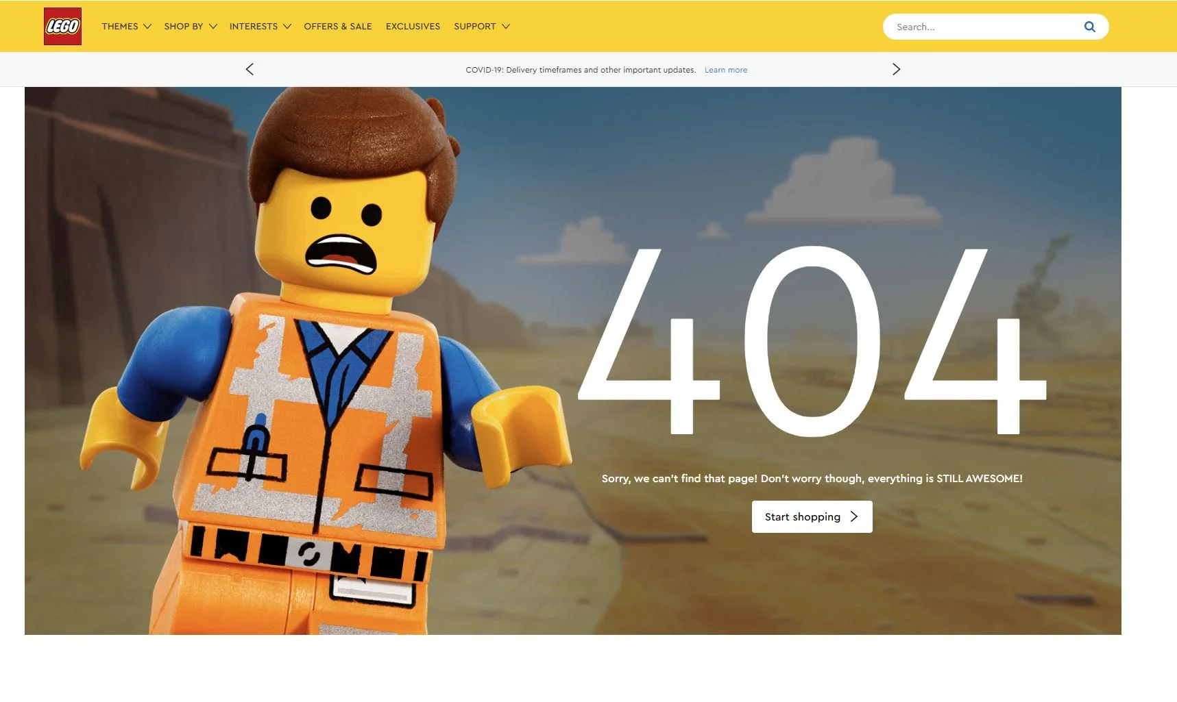
Lego 404 Error page: Using product image and reference to the Lego Movie ‘everything is awesome’ - link to shop.
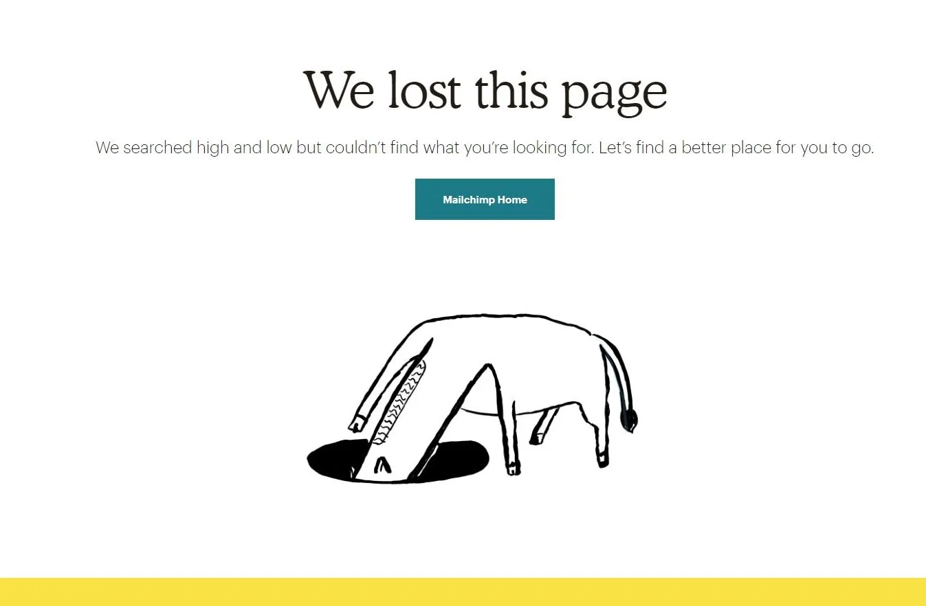
Mail Chimp 404 Error page: Clever messaging and illustration that works well with their brand - link to home page.
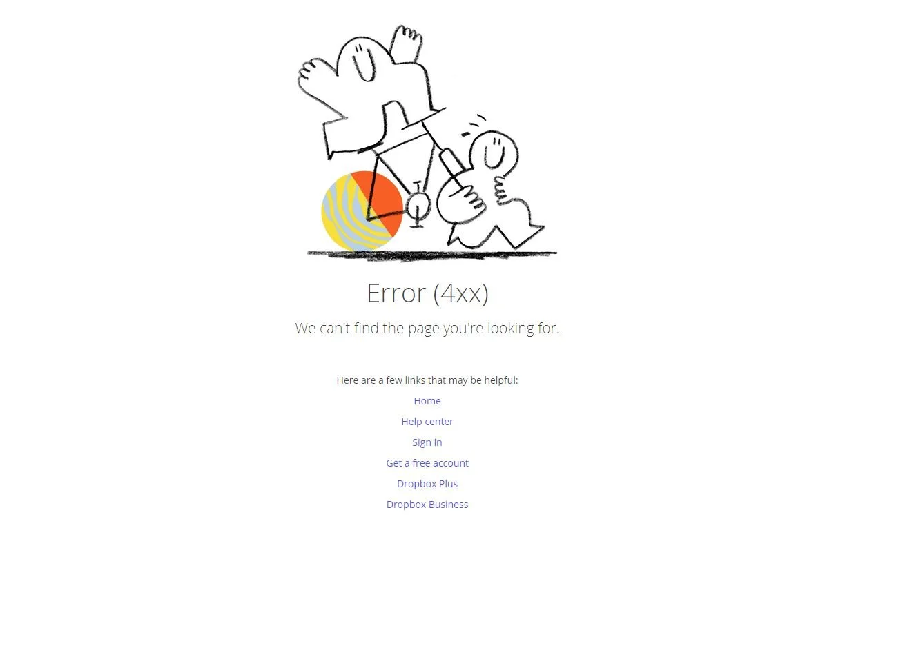
Dropbox 404 Error page: Simple message well branded and lots of options to navigate.
Apple 404 Error page: Very simple and minimalist (as per brand) with option to search.
Glossier 404 Error page: Clever words ‘keep on moving’ that works with the illustration - linking back to home.
