Creating a website footer - why is it so important & what your should include
Footer is one of the most important elements of a website - It is where visitors look for information and take action – your phone number, social links or find a page on the site.
This is especially important with a scrolling site and on mobile as a visitor reaches the end of your page and can see what you offer this is the time to take action.
Website footer may not be the most exciting section of your site but a simple and easy to navigate design that works with your site is important.
Keep it simple, use a solid color that is easy to read and organise the information to help visitors find what they want quickly. If your footer includes many links consider adding a ‘sub footer’ in a different color to help organise the information.
It is also a section that is part of your website structure and appears at the end of each page of your site which makes it even more important.
So, what to include in website footer?
There are a few essentials that must be included as visitors are used to looking for these elements in a footer:
CONTACT DETAILS
Choose the main ways you want to be contacted by – phone, email and a link to a full contact page. (read my post about contact pages here)
Make sure both email and phone and set as links so visitors can act and call or email with one click.
SOCIAL MEDIA LINKS
Especially if you did not include social links in your top navigation – some visitors would like to follow you and connect on social media so make it easy for them to do so.
LOGO OR ICON
As visitors reach the end of your site remind them about your brand. It does not need to be a full version of your logo and perhaps a one color option, but it helps re-enforce the brand. If you have any sub brands or family brands this is the time to include them and link.
LOGOS FOR ASSOCIATIONS
If you are a member of an association or are funded by someone, the footer is a good place to remind visitors of this – for example ‘master builder’
WEBSITE MAP
Include links to ALL pages of your website – even ones that are not in top navigation – for example policies. Make sure that the pages are organised in sections and easy to follow – sometimes tow or even three columns. If you sell a product include your main product categories.
COPYRIGHTS INFORMATION
Typically bottom right corner and should include the copyright symbol, year and full business name.
CALL TO ACTION
All information on your footer is in fact call to action but sometimes there are specific actions you would like visitors to take – for example subscribe to mailing list or ask for a quote.
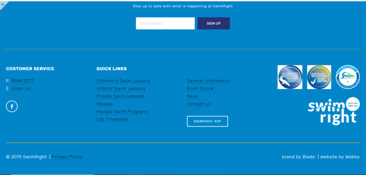
The bellow examples show some footers created by Webby (all are Squarespace websites footers) showcasing the elements discussed in this article.
If you need help with your website, contact Webby - would love to hear from you and help you with your website.


